Divas & Drag visual identity
Divas & Drag visual identity
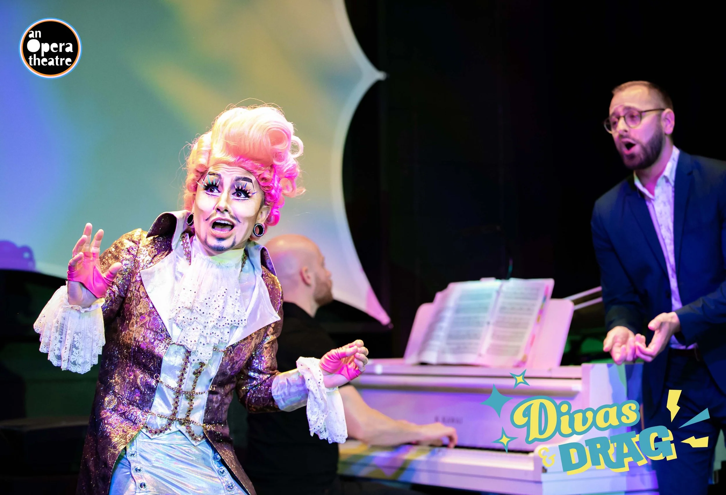
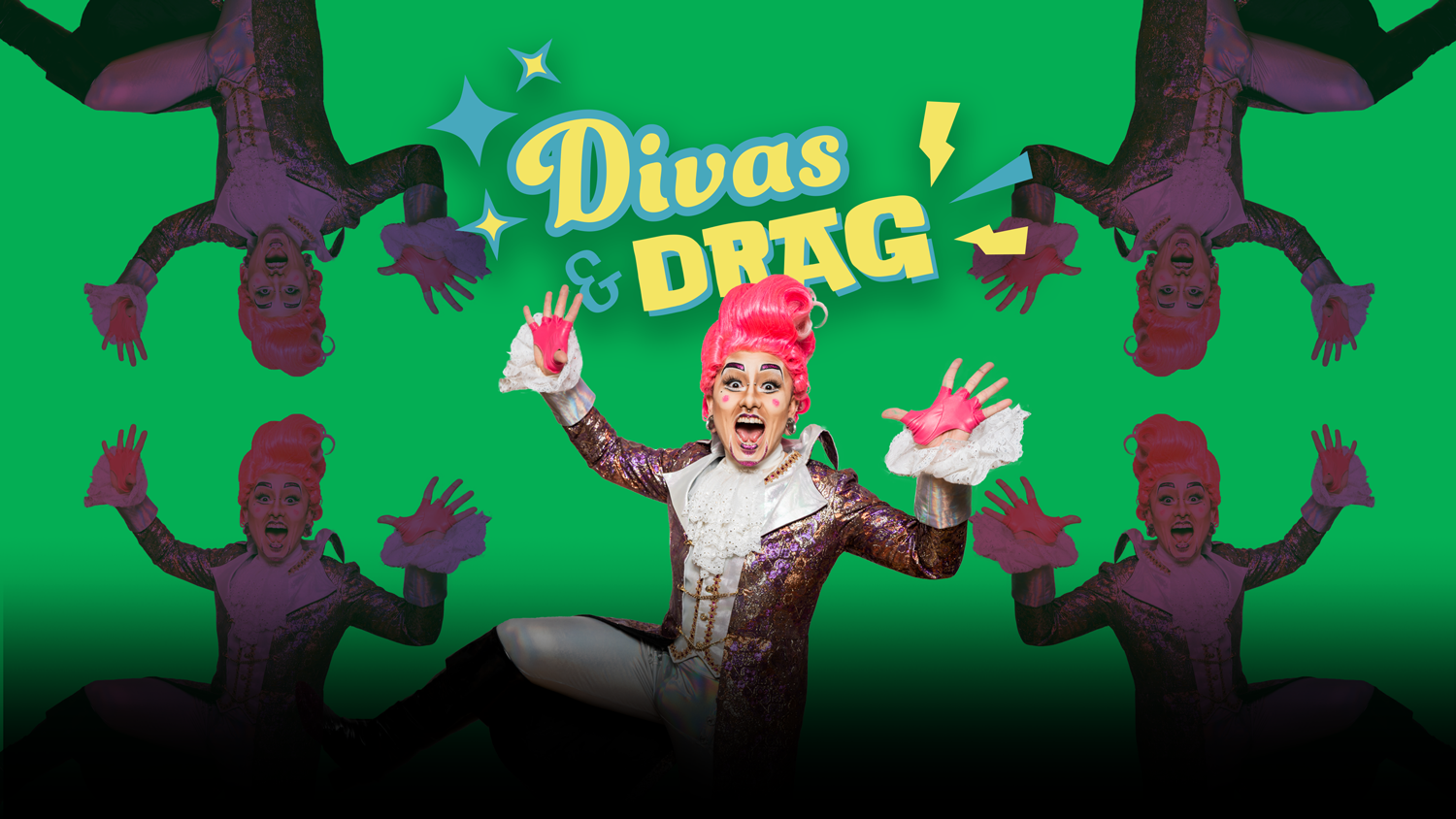
I partnered with AOT to help redo the brand identity of (in my factual opinion) the world’s dopest drag show. This was the first show they did after the anti-recess known as COVID, so they really wanted to kick in the door with the reintroduction.
The Process
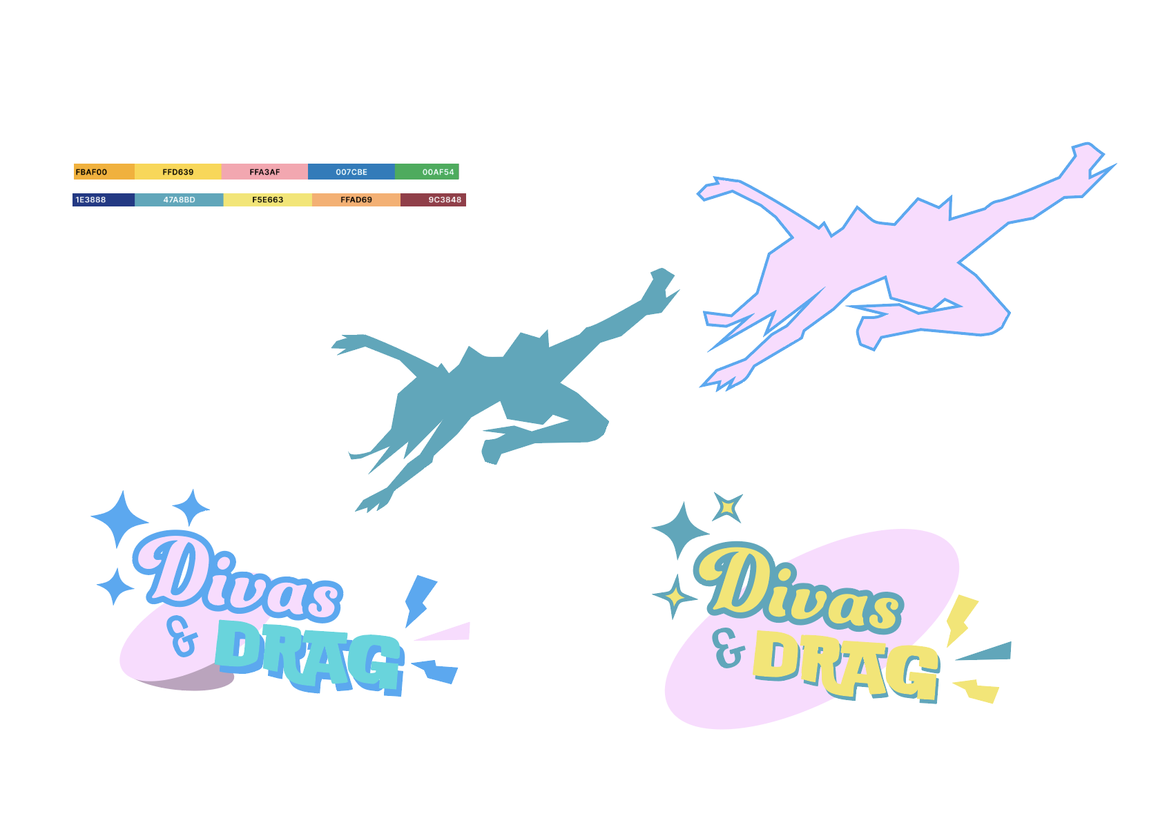
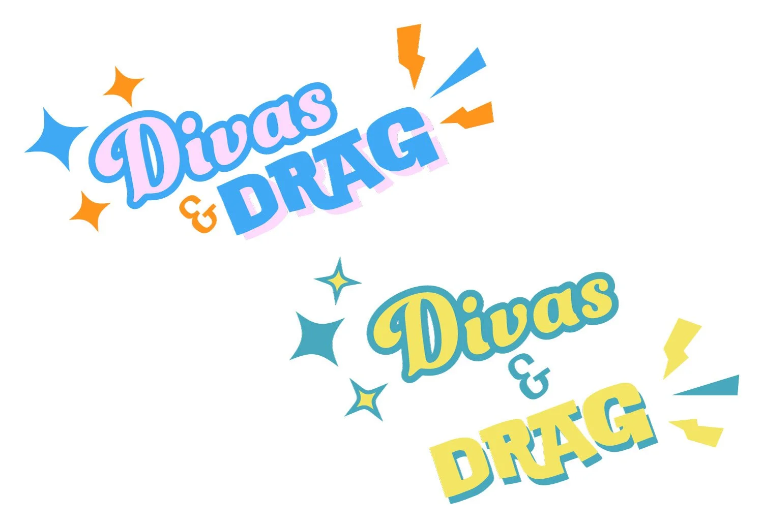
The old logo was appropriate for its time. It was a mashup of the loud fabulousness of Drag shows with the classic loudness of opera singers. The new identity needed to look more confident, nimble, and sure of its place in the performance industry. It was also happening while the drag show bans were starting. So we wanted to stand on business.
Play was super important to this project. The event was so FUN, loud, and free. So I made sure to put myself in a mood that lent itself to being able to create thusly. The death drop didn’t make it. This time…mwa ha ha ha. Sorry.


